The Golden Goblet
04
TYPOGRAPHY
2018
EDITORIAL DESIGN, PHOTOGRAPHY
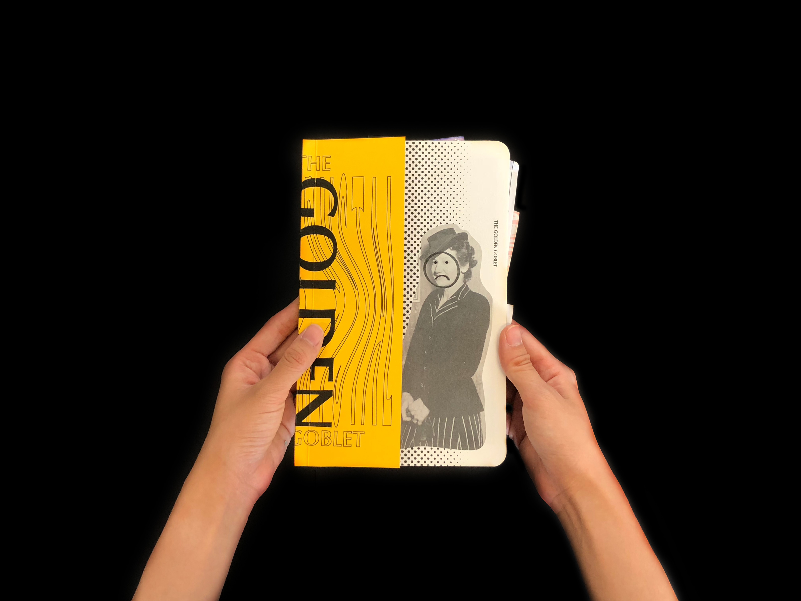
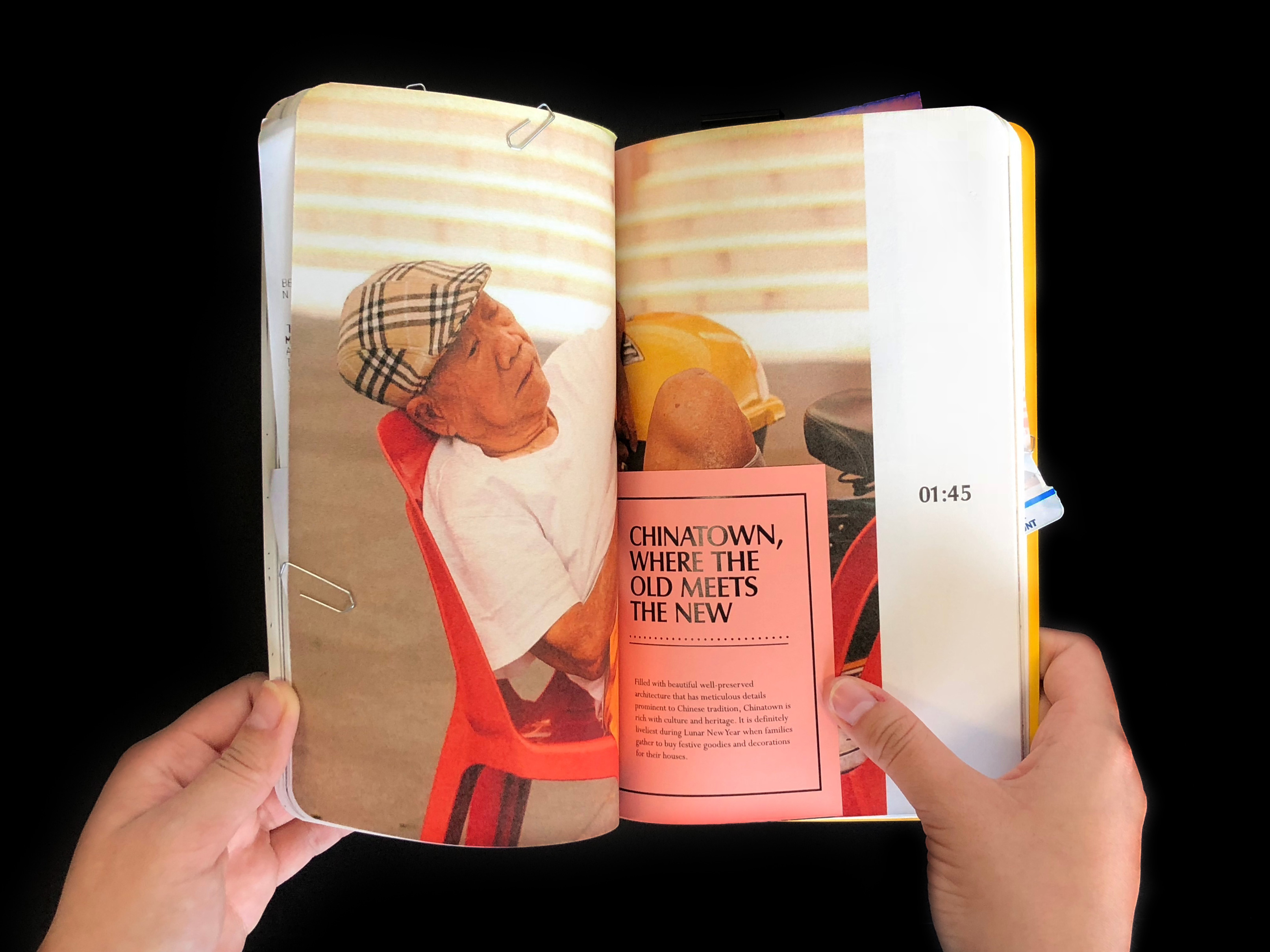
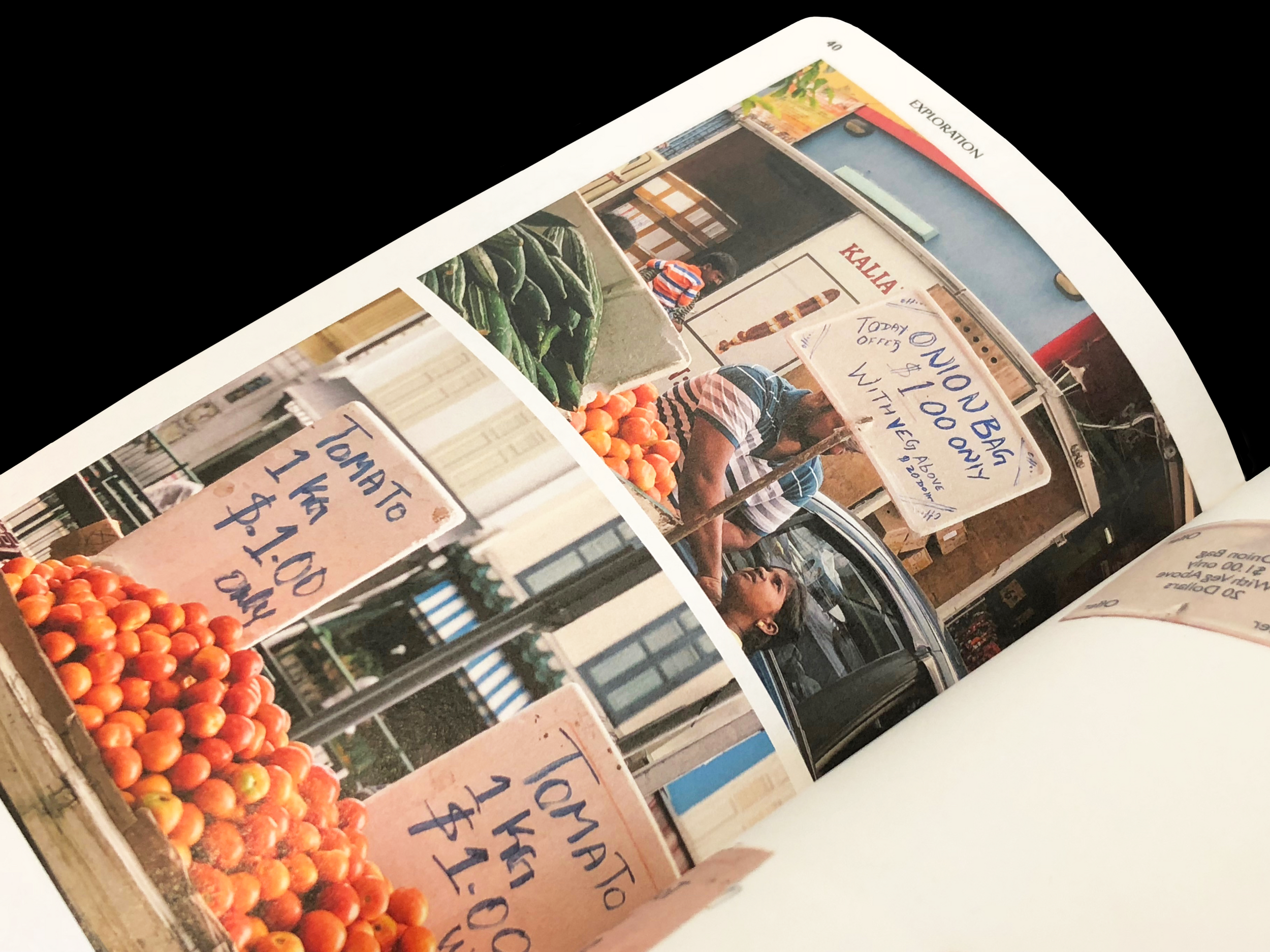
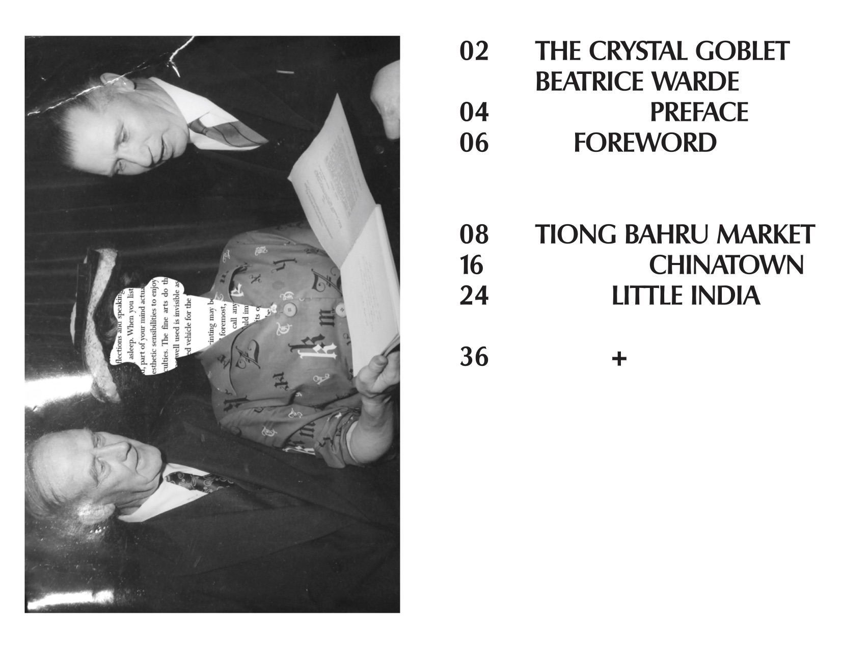
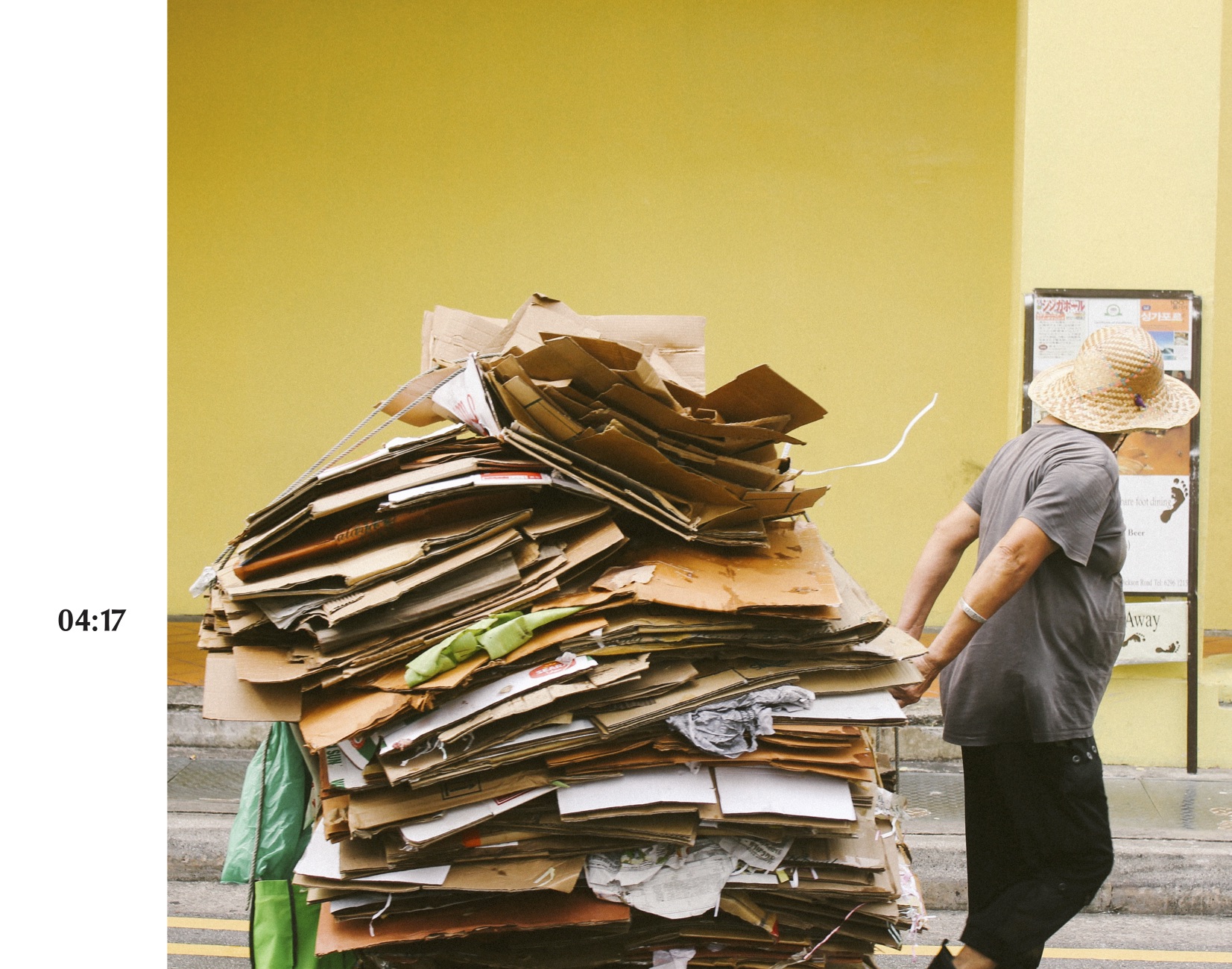
The Crystal Goblet, or Printing Should Be Invisible by typographer Beatrice Warde (1900 – 1969). The essay brings about the metaphor of how typography parallels to a crystal goblet; discussing the how type should be invisible where the reader only focuses on the content – parallel to wine. As a group, we disagree with Warde’s stance. We believe that type should be driven by its content. Dependent on the context, character, style, and personality of a type should be made visible in graphic design. Our approach to this editorial addresses the duality of type that should take under varying context through comparisons. This in which we have replaced different typography found around Singapore and reduced it to what Warde has deemed as a proper typesetting. The comparison of the two shows how essential the various kinds of typography is to bring about the culture and identity of the space. In that, we stand by the metaphor of a “golden goblet”. This editorial takes on the perspective of a persona in their daily routine; journaling and reflecting on type they see in their everyday surroundings, making comments and comparisons.
COLLABORATORS: ANN, AXEL, KYLIE, YI JING
Size: 140x220mm
Paper: Munken Print White 115gsm
Finishing: Perfect bind with rounded edge corner

